I. Introduction
Table of Contents
Brief overview of Spotify
Spotify is a digital music streaming service that offers access to millions of songs, podcasts, and videos from artists all around the world. Offering a wealth of content from global superstars to emerging artists, Spotify allows users to seamlessly discover, manage, and share music on several different platforms.
Introduction to the concept of a “Spotify Pie Chart”
A Spotify Pie Chart is a visual representation of a user’s music listening habits. It breaks down the genres of music that a user listens to, providing a pie chart that visually represents percentages of each genre. This personal musical profile offers a unique insight into one’s musical preferences and tastes.
Purpose of the Article
The purpose of this article is to guide readers in understanding and interpreting their Spotify Pie Chart. By exploring deeper into this quantitative snapshot of musical tastes, we can better appreciate the diversity of our preferences and explore new genres that we might not have considered before. We aim to help readers gain a deeper connection with music through a more informed understanding of their listening habits.
Understanding the Spotify Pie Chart
Definition and Explanation
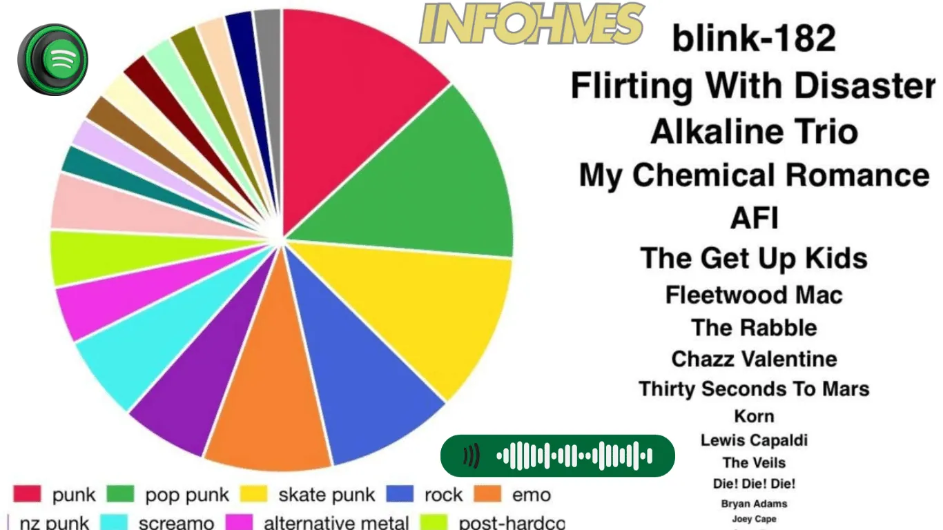
A Spotify Pie Chart is essentially a graphical illustration of a user’s listening habits on Spotify. Each slice of the pie represents a different music genre, with the size of the slice indicating the proportion of that genre in the overall listening habits of the user.
How it is Generated
Here’s how Spotify generates pie charts based on the user’s streaming history:
- Tagging songs: Every song that a user listens to on Spotify is tagged with one or more genres.
- Compiling data: As the user listens to more songs, Spotify compiles this data to form a comprehensive profile of the user’s music preferences.
- Genre information: This data includes information on the genres of music the user enjoys the most.
- Data translation: Spotify then translates this data into a pie chart.
- Representation: In the pie chart, each genre is represented as a proportion of the total music listened to.
- Slice size: The size of each genre’s slice in the pie chart indicates how much of the user’s music listening time is devoted to that genre.
- Visualizing preferences: By visualizing the user’s music preferences in this way, Spotify provides a clear and intuitive representation of the genres that make up the user’s music library.
By following these steps, Spotify enables users to gain insights into their music preferences and explore their listening habits through visually appealing pie charts.
Significance in the Context of Music Streaming
The significance of Spotify Pie Charts in the context of music streaming cannot be overstated. They offer a personalized, visual snapshot of a user’s music taste, which can lead to a deeper understanding and appreciation of one’s music preferences.
These charts can also inspire users to explore new genres, thereby broadening their musical horizons. Spotify uses this information to suggest new songs, artists, and playlists, ensuring that the user’s musical exploration never ends.
How to Get Your Spotify Pie Chart?
Finding Your Spotify Pie Chart
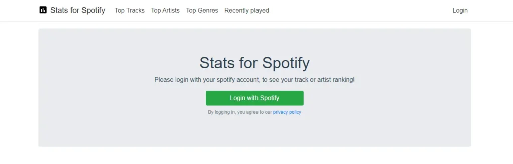
To find your Spotify Pie Chart, you will likely need to use third-party apps or platforms that use Spotify’s public API to generate the chart.
Platforms such as Stats for Spotify or Obscurify Music can create a comprehensive visual breakdown of your music listening habits on Spotify, including the much-desired pie chart.

Accessing the Chart on Different Devices
Regardless of the device you are using, accessing your Spotify Pie Chart is a simple process.
- Web: Visit the web platform of your chosen third-party app e.g., Obscurify Music, and log in with your Spotify account. The platform will then generate and display your Spotify Pie Chart.
- Mobile: Similarly, on mobile devices, open the web browser, visit the chosen platform’s website, and sign in with your Spotify account to access your chart.
Remember to always verify the trustworthiness of third-party platforms before logging in with your Spotify credentials.
Importance of the Spotify Pie Chart for Users
The Spotify Pie Chart holds immense value for users. It serves as a mirror to one’s musical soul, reflecting the diversity and depth of their musical tastes. By understanding the distribution of genres in their music listening habits, users can gain an increased understanding of their preferences.
This comprehension can lead users to explore genres they may not have considered earlier, leading to a richer and more diverse musical experience. Importantly, these charts also allow users to share their musical identity with others, opening new conversations and connections around the shared love of music.
How to Make My Pie
Step-by-Step Guide on Creating a Spotify Pie Chart
To create your Spotify Pie Chart, the process may vary depending on the third-party platform you choose. Here’s a step-by-step guide to help you get started:.
- Visit a third-party platform like Stats for Spotify or Obscurify Music.
- On the platform’s website, look for the option to log in using your Spotify account.
- Click on the relevant login option and you will be redirected to the Spotify login page.
- Enter your Spotify credentials and click “Log In”.
- Once logged in, the platform may require you to grant necessary permissions to access your Spotify data. This is to ensure the platform can analyze your data accurately.
- Review the permissions requested and click on “Agree” or “Allow” to grant access.
- After granting permissions, the platform will start analyzing your Spotify data to generate your personalized Pie Chart.
- Depending on the platform, the analysis may take a few moments or longer, so please be patient.
- Once the analysis is complete, the platform will present your Spotify Pie Chart, showcasing various statistics and insights based on your listening habits.
Please note that the exact steps may vary between different third-party platforms, but this guide provides a general overview of the process.
Customization Options for Users
Customization options vary from platform to platform. Some might allow you to select the time period (e.g., last month, last six months, all time) for which you want to generate the pie chart. Others may offer options to include or exclude certain genres or to display your top artists along with their corresponding genres.
Potential Challenges and Solutions in Generating the Chart
Potential challenges in generating your Spotify Pie Chart might include issues with data privacy, inaccuracies in genre tagging, or discrepancies in the period of the analyzed data.
It’s crucial to ensure the third-party platform you’re using is reliable and respects data privacy. If you encounter inaccuracies, consider that Spotify’s genre tagging system might not always perfectly match your perception of certain songs’ genres.
As for discrepancies in the period of data, some platforms may only analyze a limited period of your Spotify history, so make sure to check this before you generate your pie chart.
How to Decipher My Pie Once It’s ‘Baked’?
Understanding the Components of the Spotify Pie Chart
The Spotify Pie Chart, once generated, presents a colorful array of segments, each representing a different genre you’ve been listening to.
The size of each segment corresponds to the proportion of that genre in your total listening history. You’ll also find the names of the genres on or next to the segments, helping you identify what each color on the pie chart represents.
Interpretation of Different Sections
Each section of the Spotify Pie Chart represents a unique genre. Larger sections represent genres you’ve listened to more frequently, while smaller ones represent genres you’ve listened to less frequently.
It’s important to remember that the chart only includes the music you’ve listened to during the time period selected (e.g., last 6 months, all time), so the chart will change as your listening habits evolve.
Extracting Meaningful Insights from the Chart
The Spotify Pie Chart is not just a colorful representation of your Spotify usage; it is a tool for introspection and discovery.
By analyzing the chart, you can glean information about your music preferences, identify trends in your listening habits, and possibly even uncover subconscious inclinations toward certain types of music.
Recognizing genres that make up smaller sections of your chart can inspire you to explore new genres and artists, thereby enhancing your musical journey.
User Interaction with Spotify Pie Chart
Personalization Options
A Spotify Pie Chart offers users the ability to personalize their experiences, thereby making the chart a true reflection of their musical identity. Various platforms allow users to adjust the time period for analysis, choose specific genres to highlight or exclude, and even include their top artists.
By exploring personalization features, users can truly make the Spotify Pie Chart their own, providing a more precise and unique depiction of their musical tastes.
Exploring Different Views or Dimensions
Different third-party platforms offer various views or dimensions to analyze your listening habits, allowing you to explore your music preferences in depth. For example, some platforms may provide a genre view, an artist view, or a song view, each offering unique insights into your music listening habits.
The genre view can help you understand genre distribution; the artist view can help highlight your favorite artists and the song view can show your top songs over a certain period. Exploring these different views can provide a more comprehensive understanding of your musical preferences.
How to Share or Save the Spotify Pie Chart
Once you’ve created your Spotify Pie Chart, sharing it with friends or saving it for future reference is quite simple.
Usually, there’s a share button on the platform that lets you share your chart directly on social media platforms like Facebook, Twitter, or Instagram. If you want to save it, you can usually click on the “Save image” or “Download” button to download the chart as an image file.
This way, you can keep a record of your changing musical tastes over time, or use this image in a blog post, a personal website, or even a presentation.
Insights and Analysis
What Spotify Pie Chart Reveals About User Preferences
The Spotify Pie Chart provides a visual representation of a user’s listening habits, offering key insights into their musical preferences. From the proportion of different genres to the inclusion of top artists, every element of the chart sheds light on the user’s unique musical taste.
Large segments might indicate frequently listened-to genres, while smaller slices could reveal niche genres that the user occasionally explores.
The chart also highlights any changes in listening habits over the selected period, further contributing to the understanding of a user’s evolving musical preferences.
Trends and Patterns in Spotify Pie Charts
Trends and patterns in Spotify Pie Charts can manifest in a variety of ways. For instance, a user might exhibit a consistent preference for a specific genre, seen as a dominant segment in their chart over multiple periods.
Alternatively, seasonal patterns could emerge, such as a surge in holiday music during the winter months. Some users may show a diverse musical taste with a nearly equal distribution of multiple genres, while others may display a more focused interest.
Recognizing these patterns can help the user understand their listening habits and make more conscious decisions about their musical explorations.
Comparison with Other Platforms
While Spotify’s Pie Chart provides an excellent visual breakdown of a user’s listening habits, other platforms might offer different methods of musical exploration.
Platforms like Last. fm, for instance, offer ‘scrobbling’ history, tracking each song a user listens to across multiple streaming platforms, and providing detailed statistics on their listening habits.
Others, like Apple Music, generate ‘Replay’ playlists reflecting a user’s most played songs of the year. Each platform has its unique strengths and limitations, and a comparative analysis can help users choose the best tools to understand their musical preferences.
Critiques and Limitations
Criticisms and Limitations of the Spotify Pie Chart
While the Spotify Pie Chart is a valuable tool for music lovers, it is not without its limitations. For one, the chart may not perfectly reflect a listener’s musical taste, as it only includes the music played within the selected period, excluding any historical data beyond that. This could result in a skewed representation of a user’s preferences.
Additionally, the chart does not differentiate between intentional listening and background music; for example, a genre that is often played as ambiance during work might appear to be a top favorite.
Potential Improvements or Enhancements
There are several ways the Spotify Pie Chart could be enhanced to address these limitations. Firstly, offering users the ability to manually adjust the weight of genres could help provide a more accurate picture of their preferences. For instance, a user could mark certain tracks or genres as ‘background music’, reducing their influence on the chart.
Additionally, integrating a user’s full listening history, rather than just a selected time period, could provide a more comprehensive overview of their evolving music tastes over time. Finally, enabling users to add notes or tags to their chart could help them remember why certain songs or genres were played frequently during a particular period, adding context to their listening history.
Impact on Artists and Industry
How the Spotify Pie Chart effects artists
The Spotify Pie Chart, by providing visual insights into listener preferences, significantly impacts artists and their music creation process.
These insights can inform artists about the genres that resonate most with their audience, guiding their creative decisions and helping them tailor their music to better meet listener expectations.
However, there’s also a risk that artists might feel compelled to cater too closely to trends, potentially compromising their artistic integrity to appear more frequently on users’ charts.
Implications for the music industry
The music industry can also benefit from the use of Spotify Pie Charts. Music labels, for instance, can use these charts to identify emerging trends in music and guide their artist signings and album investments accordingly.
Furthermore, the music industry can also use these charts to understand shifts in listening habits over time, an invaluable insight that can inform marketing strategies and promotional efforts.
Any controversies or debates surrounding the chart
While the Spotify Pie Chart is generally well-received, it has sparked some debate. Critics argue that it promotes a form of ‘streaming culture’ that encourages artists to produce music conforming to popular trends rather than fostering originality.
Additionally, there are concerns about the chart’s accuracy in truly capturing a user’s musical tastes, as it includes both intentional listening and background music. These issues have ignited discussions about the need for more nuanced data analysis tools in the music streaming industry.
User Feedback and Experiences
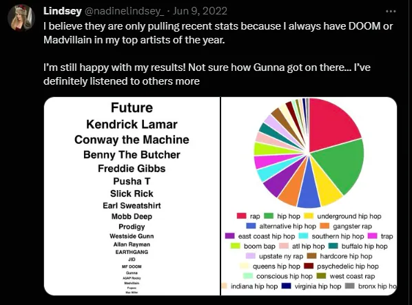
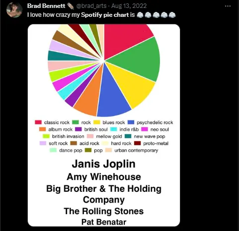
Quotes or anecdotes from Spotify users
Spotify users have shared various anecdotes reflecting their experiences with the Pie Chart. For instance, one user remarked, “It’s fascinating to see my listening habits visualized. I never realized how much I leaned towards indie rock until I saw the Pie Chart.” Another user shared, “Seeing my shift towards more calming music during exams season was a real eye-opener.”
Positive and negative experiences related to the Spotify Pie Chart
Positive experiences revolve around the tool’s capacity to provide insightful visualizations of listening habits. Users appreciate the opportunity to reflect on their musical preferences and discover trends they might not have noticed otherwise.
However, negative experiences highlight the chart’s limitations. Some users have voiced frustrations about the inability to differentiate between intentional listening and background music, which they feel skews their results. Others wished for a more detailed breakdown that includes specific songs or artists, not just genres.
User testimonial.
A testimonial from a Spotify user reads, “The Pie Chart has been a fun and informative tool for me. It’s like holding up a mirror to my musical tastes.” On the other hand, another user’s testimonial reveals some limitations, “The Pie Chart is a neat concept, but I feel it’s a bit too broad. I’d love to see it incorporate more details like my favorite artists or most played songs.”
Future Developments
Any upcoming changes or features related to Spotify Pie Chart
While Spotify has not officially announced any specific upgrades to the Pie Chart, users and industry insiders often speculate about potential improvements.
An enhanced user interface, greater customization options, and integration of more granular data, such as specific artists or songs, are among the anticipated changes. These updates could further refine the accuracy of the chart, creating a more personalized and immersive user experience.
Speculation on the evolution of the chart
As technology advances, data analysis and visualization tools are likely to evolve. The Spotify Pie Chart may expand to include more sophisticated metrics, such as mood-based or activity-based listening habits.
There might also be a move towards real-time updates to the chart, enabling users to see the impact of their listening habits as they unfold.
Potential impact on user experience
The evolution of the Spotify Pie Chart holds significant implications for user experience. Enhanced customization may enable users to gain a more accurate understanding of their musical preferences, facilitating more personalized music discovery.
Meanwhile, real-time updates could make the listening experience more interactive, allowing users to see how their current music selection impacts their overall listening habits. However, Spotify must carefully manage these developments to ensure they enrich the user experience without becoming overly complicated or invasive.
Conclusion
Recap of Key Points
In summary, the Spotify Pie Chart is an innovative tool that offers in-depth insights into users’ music listening habits, visualizing these tendencies through an accessible, engaging interface. Its implications extend beyond individual users to artists and the wider music industry, with potential benefits as well as challenges. While generally well-received, it has sparked debates around ‘streaming culture’ and the accuracy of its data.
Summary of the Significance of the Spotify Pie Chart
The Spotify Pie Chart’s significance cannot be understated. It not only enables users to understand and reflect on their music preferences but also has far-reaching impacts on artists and the music industry. From informing creative decisions to identifying trends and shaping marketing strategies, the tool has transformative potential. However, its influence also raises important questions about artistic integrity and the need for more nuanced data analysis tools.
Call to Action or Invitation for Reader Engagement
As we continue to explore the intersection of technology and music, we invite you to engage with the Spotify Pie Chart.
Observe your music patterns, reflect on the potential implications for artists and the industry, and join the conversation. After all, the future of music streaming is not just in the hands of companies like Spotify, but also in the hands of listeners like you. Your feedback can shape future developments, making the music experience more rewarding for all.